Role
Lead Product Designer
Date
April 2022 - Ongoing
Collaborators
Product Design
Engineering
Marketing
Background
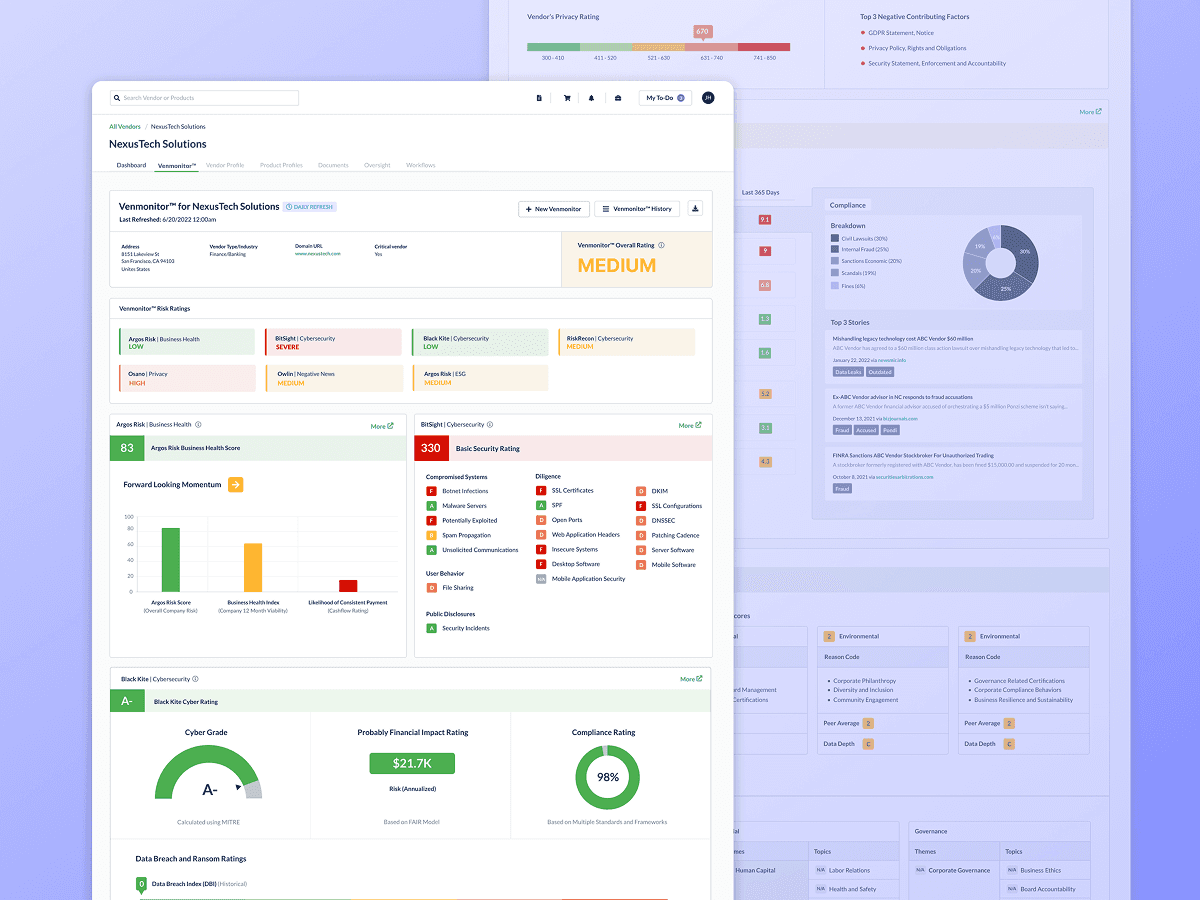
As Venminder grew, small design inconsistencies started adding up across the product. Teams were moving fast, but without a shared design language, the UI became fragmented, which slowed development and created friction for users.
I led the creation of Venminder’s first centralized design system—a scalable, reusable foundation that brought product, engineering, and marketing teams onto the same page. It improved consistency, sped up delivery, and set the product up to scale more smoothly over time.
The Problem
As Venminder’s product grew, the UI was built by different teams at different times. Everyone was moving fast, but without a shared system in place, design decisions were often made independently. Over time, this led to inconsistencies across the product that started to slow teams down and affect the overall experience.
Key User Personas

Product Designer
Goal: Focus on solving user problems, not UI details
Fear: Using the wrong pattern or creating inconsistency
Needs: Clear, reusable components

Front-End Engineer
Goal: Build features efficiently with reusable code
Fear: Last-minute design changes
Needs: Well-defined components and variants

Project Manager
Goal: Reduce delivery risk
Fear: Delays caused by design or engineering rework
Needs: Predictable timelines
Design Process
UI Audit & Pattern Inventory
The process started with a thorough audit of the product UI to understand what already existed and where things were breaking down. For tracking purposes, I also wanted to take inventory of how many different variants of the same component we had and where they were located in the platform. This helps with QA and makes it easier for developers to find the components they need.
I identified the following core components as the foundation of the design system and included their status:
Refine
Components that already exist but need cleanup, consolidation, or alignment with system standards.
Accordion - Expansion
Breadcrumbs
Buttons
Cards
Checkboxes
Colors
Form Inputs
List Items - Menus
Logo
Modals
Navigation
Popover
Radio Button
Typography
Rework
Components that exist but need more significant changes to structure, behavior, or variants.
Alerts
Icons
Labels & Chips
Progress Bars
Tabs
Tables
Toggles
Tooltips
Search
Create
Components that don’t exist yet or need to be built from scratch to support the product.
Badge Notifications
Date Picker
Sliders
Stepper
Defining Foundations and Guardrails
Before designing individual components, I established a set of foundational rules to guide decisions across the system. These guardrails helped ensure consistency and reduced subjective design debates later on.
This included defining:
Typography scales and usage
Color roles and semantic meaning (especially when using color to define risk levels)
Spacing and layout conventions
Interaction and state behaviors
By locking in these foundations early, component design became more intentional and easier to scale.
Example: A Palette with Purpose
Each color was intentionally chosen to support readability, hierarchy, and a cohesive visual experience.

Designing Core Components
With foundations in place, I focused on building a core set of reusable components that addressed the most common product needs. Each component was designed to be flexible enough to work across multiple contexts without creating unnecessary variants.
For each component, I considered:
Core use cases and edge cases
Variants, states, and responsive behavior
Accessibility and readability
How the component would be reused across the product
Example Table Component:
A breakdown of each component within a table, including the variations needed to support more complex layouts.

Example Toggle Component:
Different toggle switch variations to accommodate various use cases and space limitations in the UI.

Iteration Through Design Reviews & Engineering Collaboration
Design system updates were reviewed in weekly design reviews, where components and patterns were shared early to gather feedback and align on decisions. In parallel, designs were regularly reviewed with the lead engineer to get input on feasibility, edge cases, and long-term scalability.
This close feedback loop helped shape components that were not only visually consistent, but also practical to build, reuse, and maintain in code. By involving engineering early, we reduced handoff friction, caught potential issues sooner, and built stronger, more flexible components.
Outcomes & Impact
Other Projects